
As we develop these ideas and this model, we will attempt to communicate the ideas simply so that the ideas are accessible.
The following infographic is an attempt to communicate the essentials of building SRD-ARA learning responses.
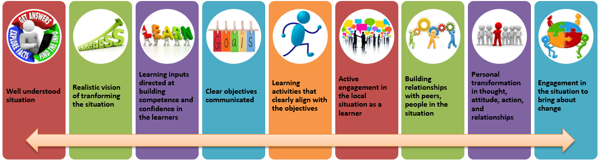
The arrow along the bottom represents that the writer and the learners are both actively engaged in each aspect of the learning as they progress through the course/workshops/learning. For example, the learning developer does not abandon the understanding of the situation, the first step. The writer must keep in mind that the learners must explore the situation themselves. The writer must find ways for the learners to engage with the situation in order to learn from it. You can see this in the progression above. The arrow is meant to remind the viewer that there is movement back and forth as the learners engage with the material, with each other, with the situation and the people in it.
It should be obvious from this infographic that SRD-ARA learning is developed, delivered, and experienced differently than the way that most of us experienced our education. SRD-ARA calls for rebuilding what we normally think of as training or education. SRD-ARA is not accomplished through adding classroom discussions, activities, or projects. The objectives and assessments within the SRD-ARA model dictate that the learning be focused on more than the understanding of the topic and assessment of that understanding.
Hopefully the infographic helps understand some of that change.
Comments
Richard
28th November 2017 15:34pm
I like the infographic very much. I think it covers most of what I say in my later post. I wonder if we need a graphic along with this which emphasizes the key shift in how we should think about training. For me it is the shift from generic, principle-based training to training that equips someone to transform a specific situation.
Send a Reply
Replies
Manley
30th November 2017 9:11am
This is a wonderful graphic! It is amazing how much better and quicker a picture can communicate concepts! And I like the fact that this is driven not just by the course writer, but also by the learner. With that in mind, I'd almost like two arrows, but that might compromise the simplicity of this design. Great job, Nicholas!!
Send a Reply
Replies
Send a Reply